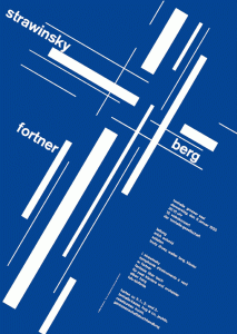
A grid system is a grid which is able to help graphic designers in organising information on a page. Basic grid systems have been around ever since the middle ages but a group of graphic designers created a more logical and organised structure to work from. Using the grid systems allows you to arrange elements within a design well and in an orderly manner.
Diogo Terror. (2009) Lessons from Swiss Style Graphic Design [Online]. Available from: http://www.smashingmagazine.com/2009/07/17/lessons-from-swiss-style-graphic-design/ [Accessed 19th April 2015].
 The Grid System website – Grid on show. (2012) [Online Image]. Available from: http://anacoquet-discourse.blogspot.co.uk/2013/05/grid-systems.html [Accessed 19th April 2015].
The main concept of using grid systems in designing is to create a strong visual design which has balance and coherence. Also these type of designs “enhance the visual experience of visitors”.
Examples of Grid-based design
Vitaly Friedman. (2007) Designing with Grid-based Apporach [Online]. Available from: http://www.smashingmagazine.com/2007/04/14/designing-with-grid-based-approach/ [Accessed 19th April 2015].
The Swiss Grid Style was developed by Swiss designers like Armin Hoffman (1920), Emil Ruder (1914–1970) and Josef Muller-Brockmann (1914-1996).
Armin Hoffman
Focusing on the strength of simplicity and the quality of being graceful. I really like this poster design because it shows how minimal elements arranged in a sophisticated manner can be so powerful and effective. The type in this design is clean and positioned in a forceful way; rotated and bold. The black and white photography is also something I notice is used a lot in Swiss designs as it is simple and eye- catching.
Emil Ruder
Again black and white is used in these designs with a little red being introduced on the left poster. I like these posters because again they are simple and the positioning of the type has been well thought through using a coherent structure.
Josef Muller-Brockmann
Muller- Brockmann’s work includes more colour than the previous two designers and I believe there are more aspects to focus on. Image and type are explored more. The well-structured designs are powerful and clean. They are consistent which makes it clear to see the swiss grid system has made a positive impact.
These 4 posters designs were created by Muller-Brockmann for the ‘Musica Viva’ series. “If you look at Muller-Brockmann’s ‘Musica Viva’ poster series, there’s not a musical instrument or musician to be seen, he used shape, structure, motion, color, and typography to evoke the feeling of music.”- Mike Joyce, owner of stereotype design in New York city. I really like this quote because when you do look at the posters it is them 5 elements which Muller-Brockmann has used to portray music. I think shape is the main element which helps stimulate the thought of music and bring it to mind. This is more visually recognisable in the far right poster as the curved rectangles look like a speaker getting smaller on the inside.

 Sarah Joyce. (2015) Swiss Poster Design [Online Moodle Page]. Available from: http://elearning.bolton.ac.uk/file.php/11283/Graphic_Design_Notes_week08_SWISS.pdf [Accessed 19th April 2015].


